Branding concept
FFManager: A toolset for training, tactics, and player development in youth football
Project overview
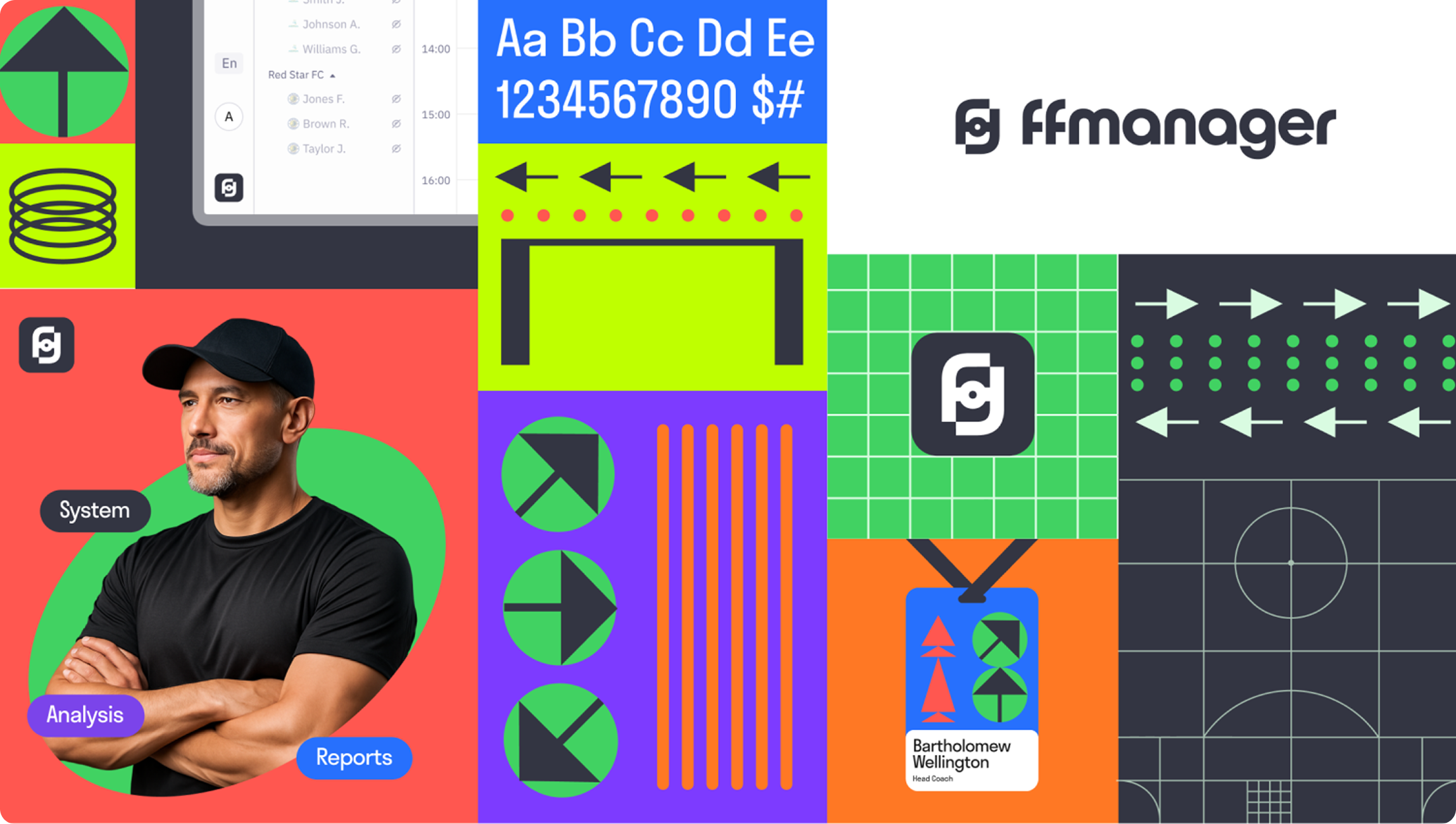
FFManager is a training platform I designed for Freedom QJ League, Kazakhstan’s youth football league. By 2025 it had grown into a real product — its own team, its own users, its own expertise — but visually it was still borrowing from the league it grew out of. This is how I gave it an identity of its own. It went on to win Silver for Product Branding at the Workspace Digital Awards.
Problems
A real product hiding behind someone else’s brand
By 2025 the platform was showing up in the media, at events, in marketing — but it had nothing that looked like its own brand. With no logo of its own, the league’s mark was simply recolored and stretched to fit. So a product with genuine expertise and real value for coaches kept getting read as just another part of the league. Nobody had asked for a rebrand. But after two years designing the platform, the gap was hard to ignore — so I proposed the work and took it on myself, developing the whole concept on my own.
Approach
I didn’t start in a design tool — I started with coaches
Before drawing anything, I wanted to understand the people the product exists for. I talked to coaches across different teams and to the analytics staff, and I dug past surface-level opinions into what actually drives them — why they coach, what they care about, and where the platform rubbed them the wrong way. One thing kept surfacing: to some coaches, the platform felt like something watching over them, collecting reports, handed down from above. That reframed the whole job for me. This wasn’t a paint-job — it was about easing that tension and earning trust. The identity had to say, plainly: this is a tool built for you and around you, not one pointed at you. So I made a decision that shaped everything after it: build the entire visual world out of things coaches already live with — the pitch, their gear, the way they sketch a play.
The system
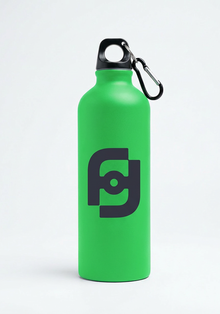
A mark drawn from the pitch. A coach’s workplace is the field, so I based the logo on its rectangle and the letter F — a small nod to Freedom that stays quiet rather than loud. For the lettering I looked at old football magazine covers, where heavy geometric type had to read from across a room and carried a certain swagger — the right energy for a product that’s about confidence and clarity.

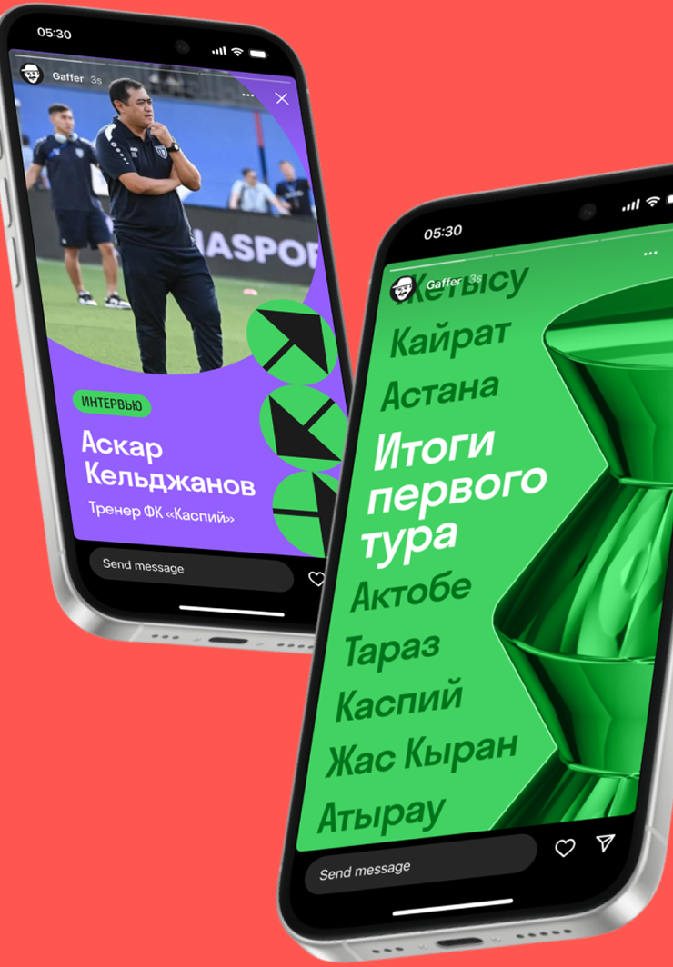
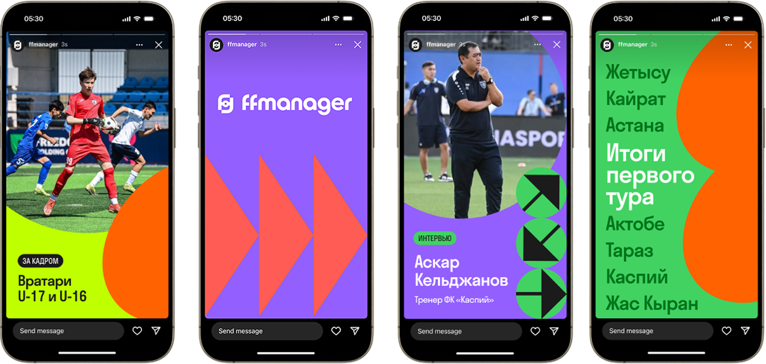
Color pulled from the touchline. Rather than invent a palette, I took the colors coaches see every session and read instantly: cone orange, pitch green, stadium-seat blue, bib purple, barrier red. Loud, warm, and a little playful — fitting for a youth league.
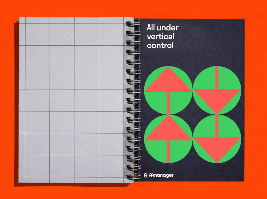
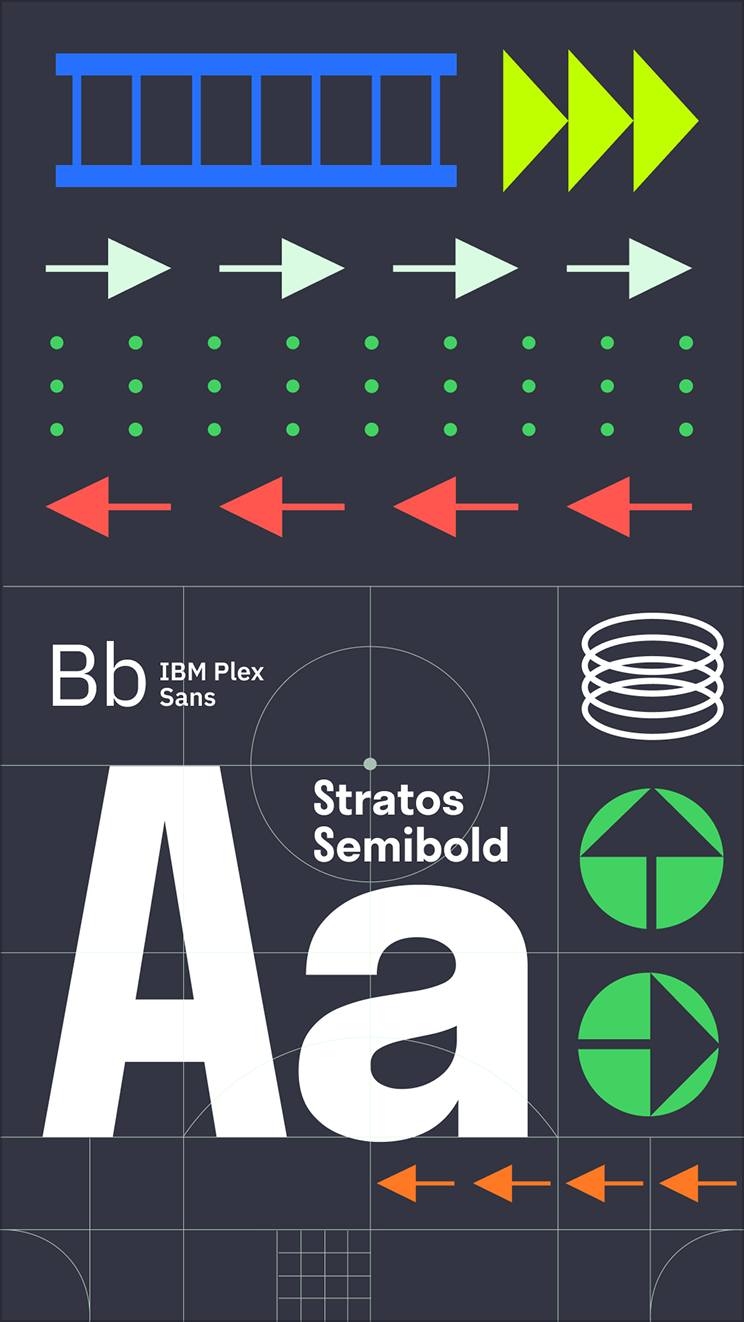
Two typefaces, two jobs. Stratos Semibold carries headlines — dense and characterful, athletic in its proportions, serious without stiffness. IBM Plex Sans does the quiet work in interfaces and data, and since it was already the platform’s UI font, it kept the brand and the product speaking the same language.
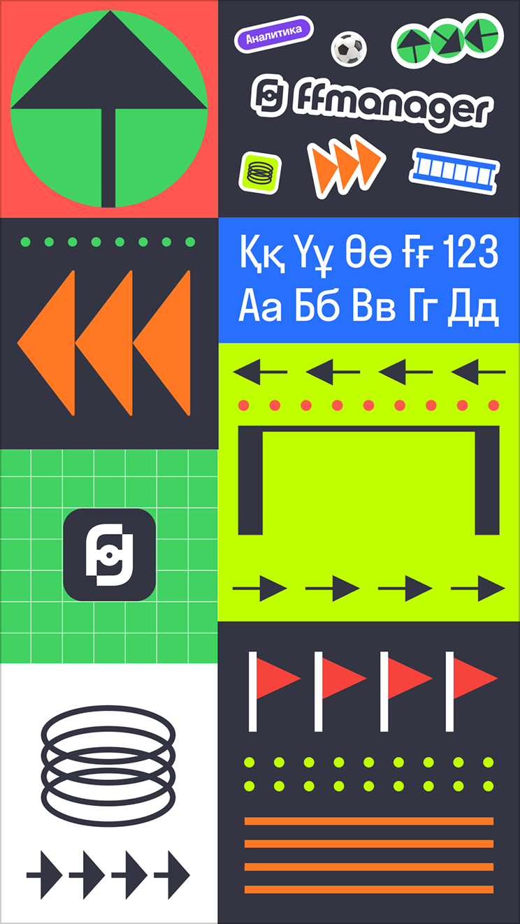
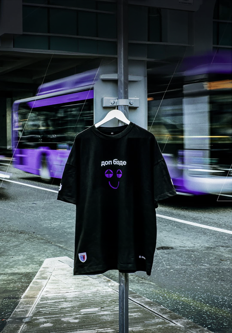
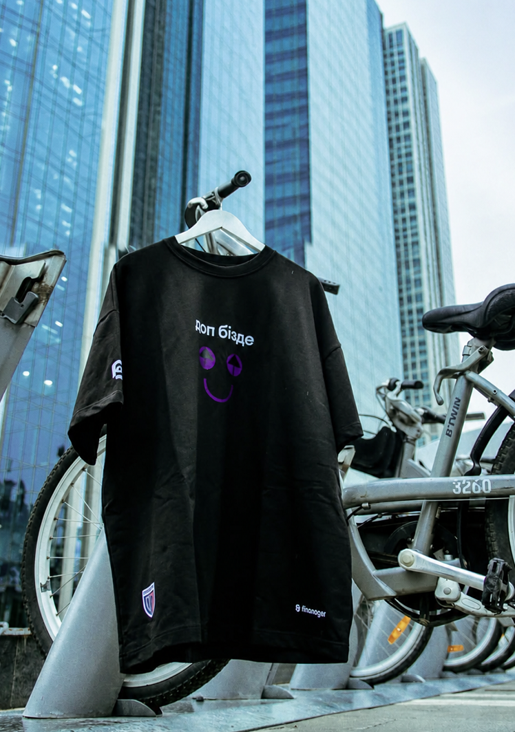
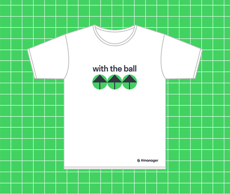
Coaching runs on communication, so the identity had to live well beyond the screen. It stretches across the site and social, presentations, event and seminar signage, and team merch — the kind of things that make people feel part of something, not managed by it. Everywhere it appears, it makes the same point: this is a product with its own weight and expertise, standing on its own.




Impact
Not a generic kit assembled at a distance, but an identity pulled from the actual world of the people who use the product every day.
Next project