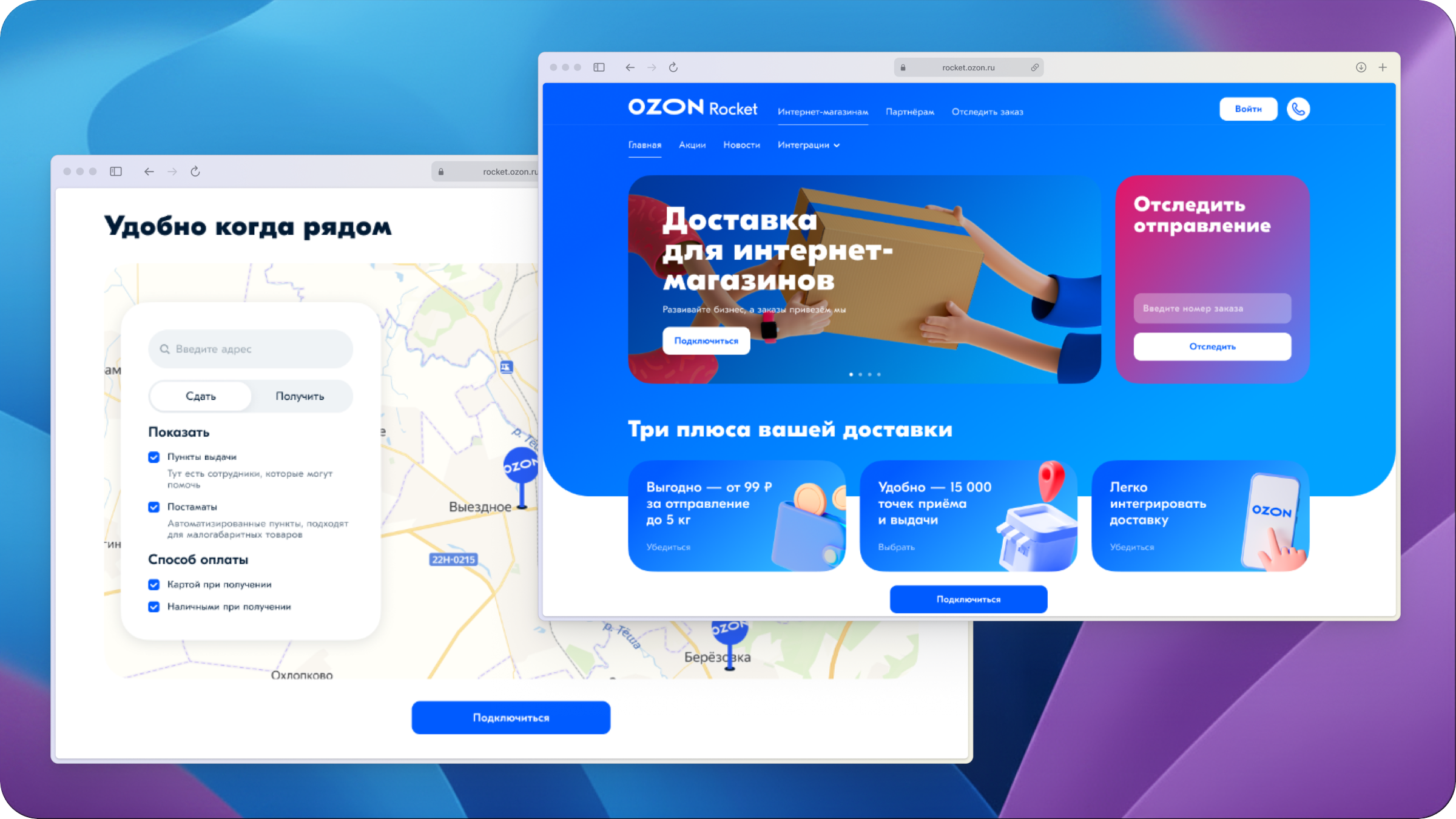
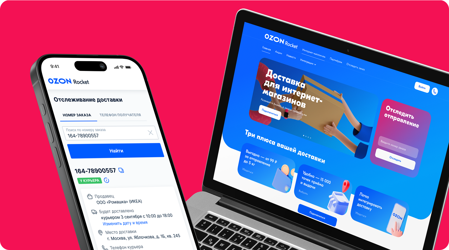
Ozon Rocket initiated a website redesign to become the leading logistics operator in Russia. Less than 3% of
users completed registration on the site, and the support center was overloaded with requests — both symptoms of
a site that failed to communicate value or guide users to action.
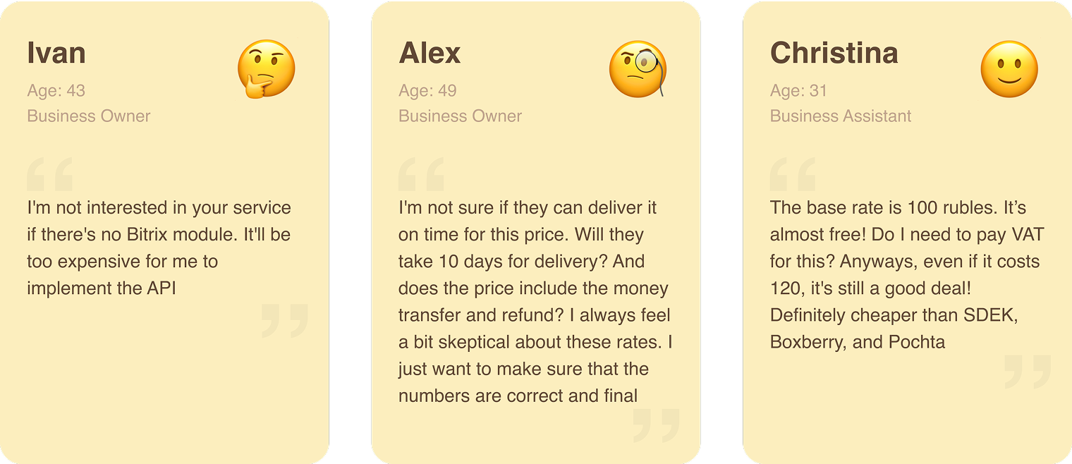
User research. I conducted interviews with 7 potential users. The key insight: easy API and
CMS integration was the primary criterion for switching to a new logistics service — and its absence was also
the main blocker for moving forward. This directly shaped the decision to add a dedicated integration
instructions page.
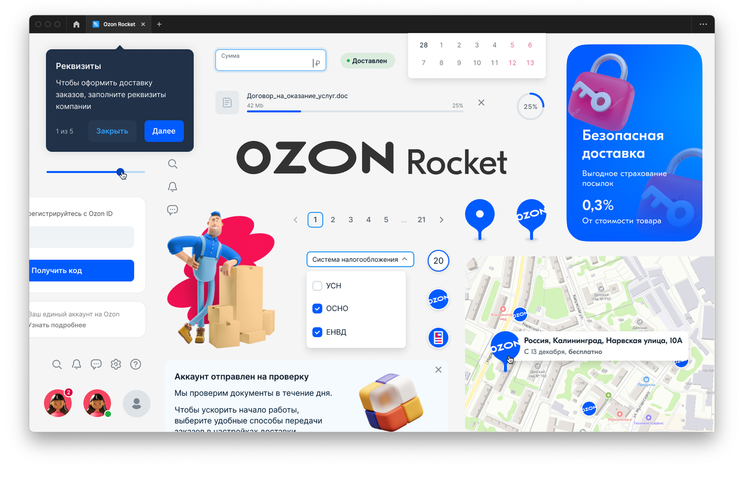
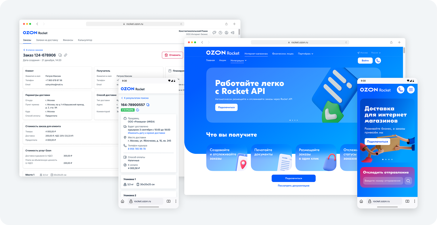
Prototype. After identifying the issues, I created wireframes and shared them across Product,
Marketing, Engineering, and with users. Wireframing let the team align on structure and flow before investing in
high-fidelity work — and surfaced several layout assumptions that turned out to be wrong early, not late.
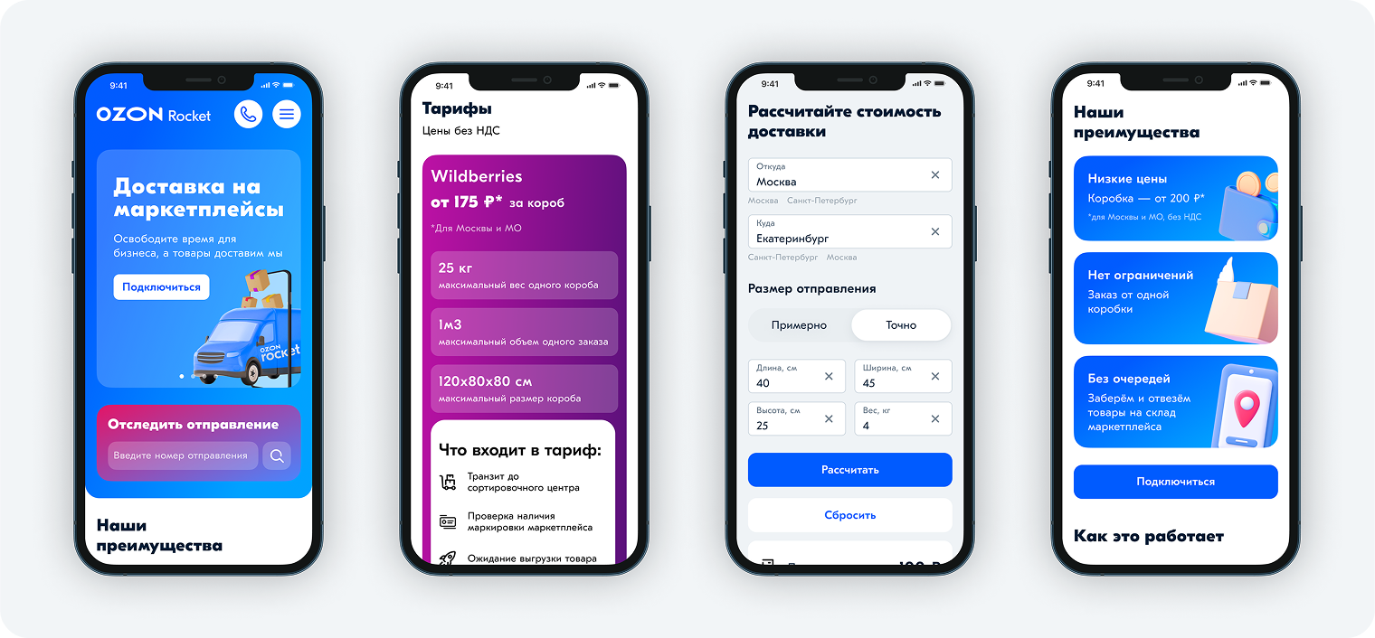
Validating the designs. As part of the UX team, I ran moderated usability testing sessions
with primary users. Participants navigated the prototype while I observed. The sessions confirmed that
navigation had become clearer and users could find pricing and integration information without resorting to
support.
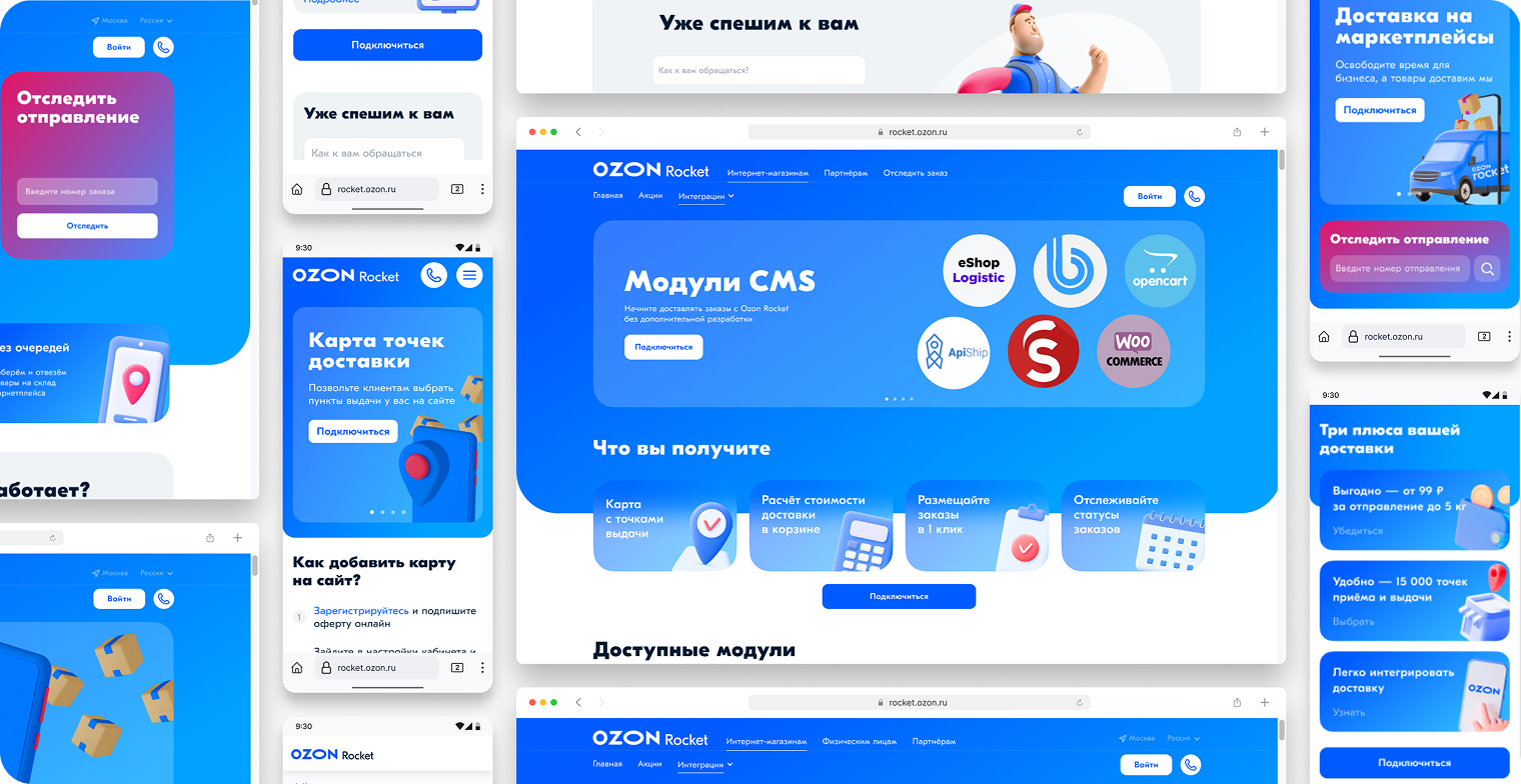
Finishing layouts. I reviewed high-fidelity layouts from the UI team against user goals and
provided structured feedback. Working with the frontend team, I specified interactions not captured in static
mockups. I then ran a UX review on every implemented ticket before it went live — a step that caught real
discrepancies that would have shipped otherwise.